TCF is an idea in which anyone has the power to design their own desk or table, making it as simple or complicated as they'd like. The design is autonomously created by a CNC router, and shipped to the customer with easy assembly instructions.
My Role:
This project was the result of my first experience with Global Hack Day; a weekend long startup competition. Our local event was hosting the "Maker Edition", which attracted a lot of engineers as well as developers, though I seemed to be one of the few designers taking on a project.
The Goal:
When I was brought onto the team they were in the process of remodeling the 15-year-old website to better-fit Fujitsu Global design standards. My goal for the CSR section of the website was to figure out usability problems, come up with workarounds, and re-design it to fit said standards.
The Process:
We all stepped into our war room, stole a white board from the other side of the library, and got to work. My attention at the beginning was to conduct a competitive analysis so we knew exactly who we were competing with, and what made us different. As it turns out, there are fairly few companies that do what we were setting out to do, but we were able to come close when looking at companies like opendesk.cc, hem.com, as well as Ikea and other DIY furniture brands. Looking at these, we came up with a few competitive advantages:
- We were planning to use an already-in-place automated process which eliminated the middlemen
- We would enable independent independent designers the ability to create and sell pieces of furniture, which we ensure are up to industry trends in both function and form.
- We would integrate “invisible” technology, such as power outlets and USB ports.
The Design:
After creating our business goals, I took on the responsibility of designing the interface for the webapp. Due to the extremely tight deadline, we made it clear that we should only design a prototype that would show the basic functions, rather than try to put on a whole show.
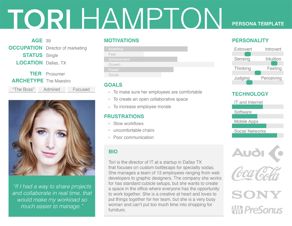
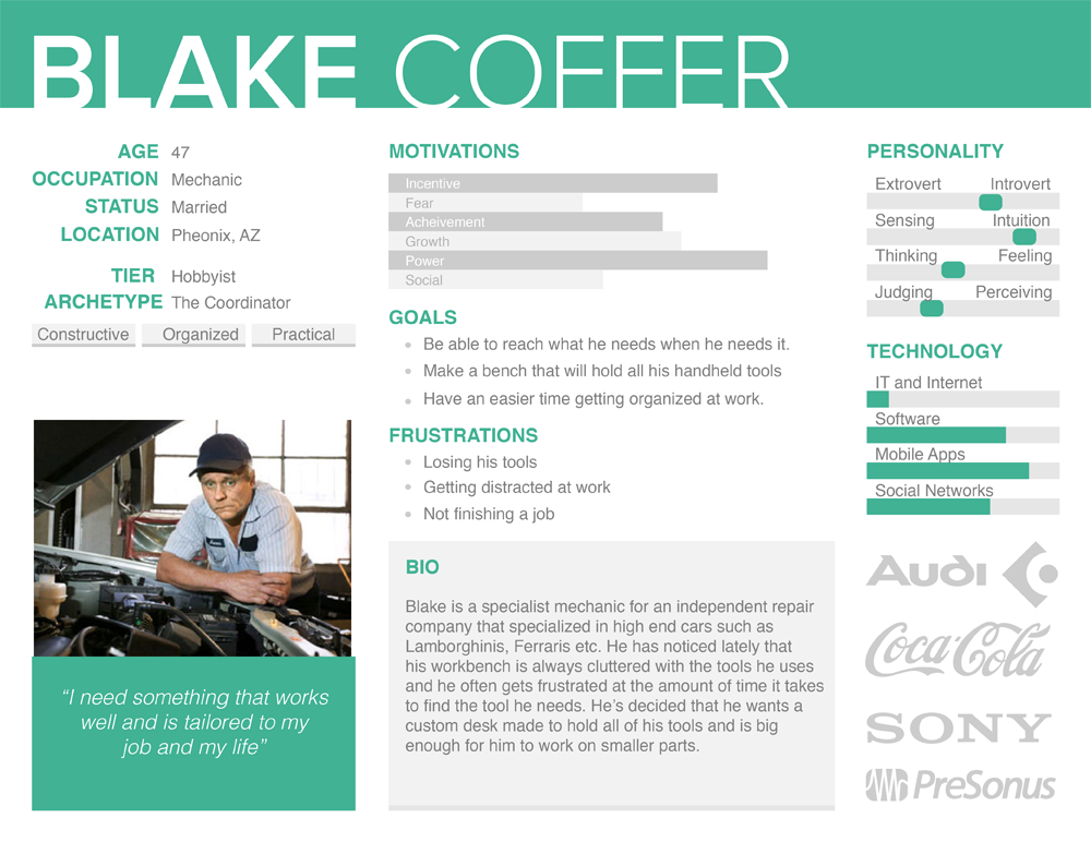
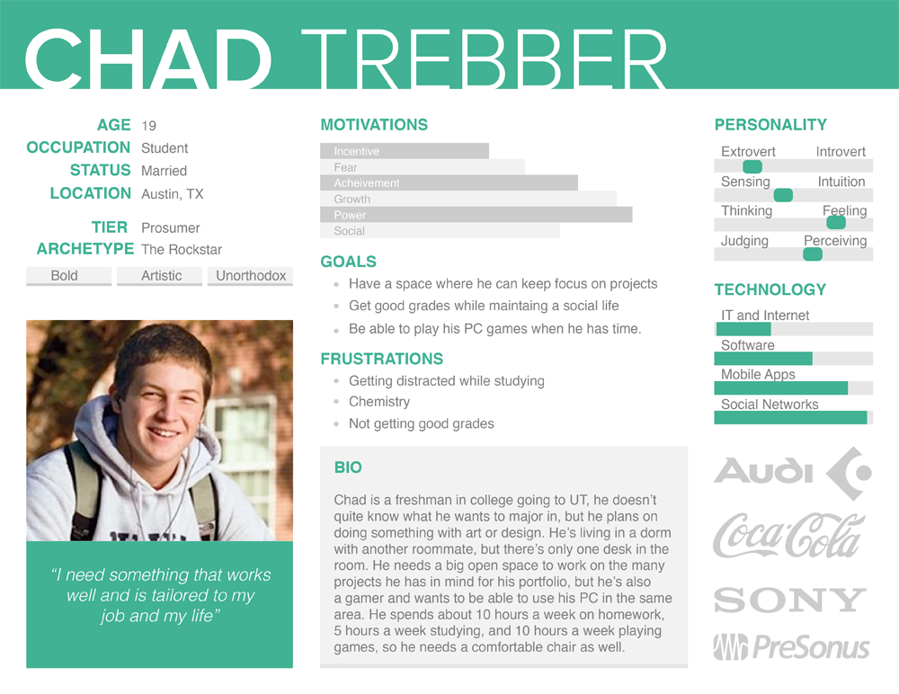
The first step when coming up with the design, after creating a basic information architecture, was to create our user personas. We needed to represent not only customers that are tech-oriented, but those who are more hands on as well. I came up with the following:
Based on these personas, and the information architecture, we then decided our users flows that I took a GREAT picture of:
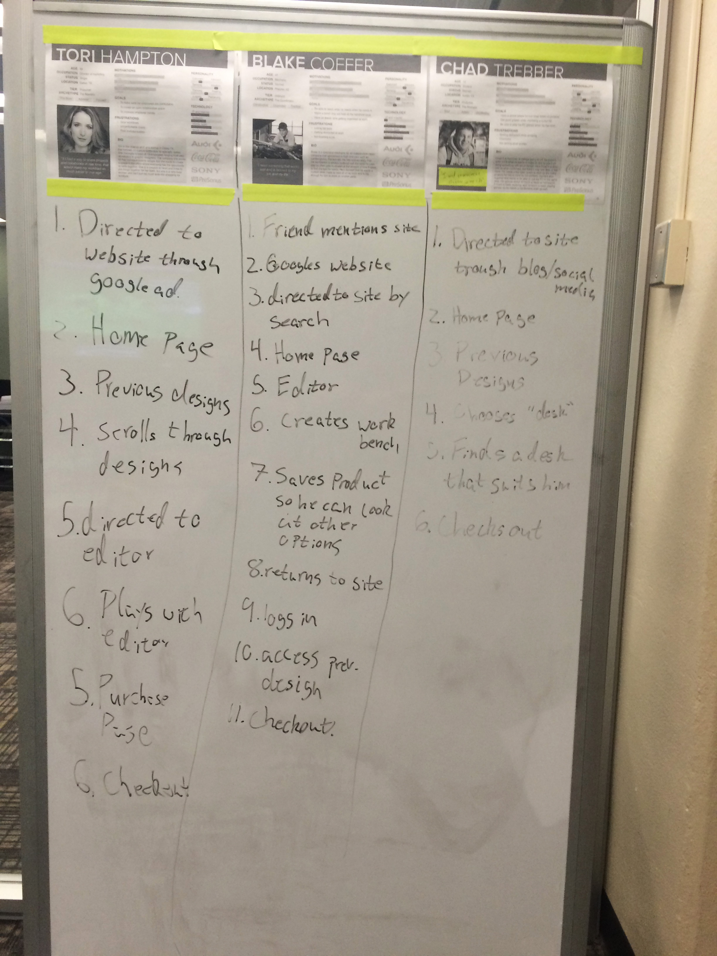
And in-case it's hard to read:
- Tori:
- Directed to Website through Google ad.
- Home page
- Previous Designs
- Scrolls through designs
- Directed to editor
- Purchase Page
- Checkout
- Blake:
- Friend mentions site
- Googles website
- Directed to site by search
- Home page editor
- Creates workbench
- Saves product so he can look at other options
- Returns to site
- Logs in
- Access previous design
- Checkout
- Chad
- Directed to Website through blog/social media
- Home page
- Previous designs
- Chooses "Desk"
- Finds a desk that suits him
- Checks out
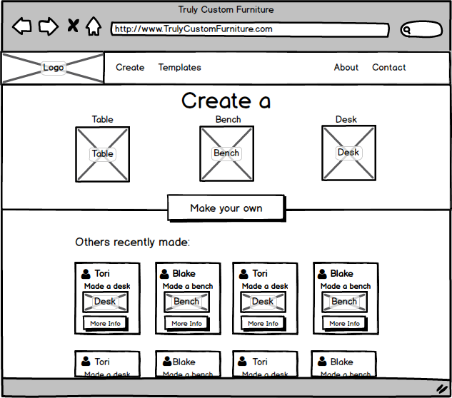
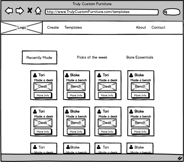
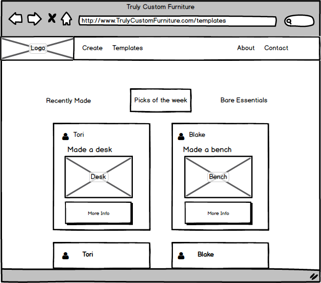
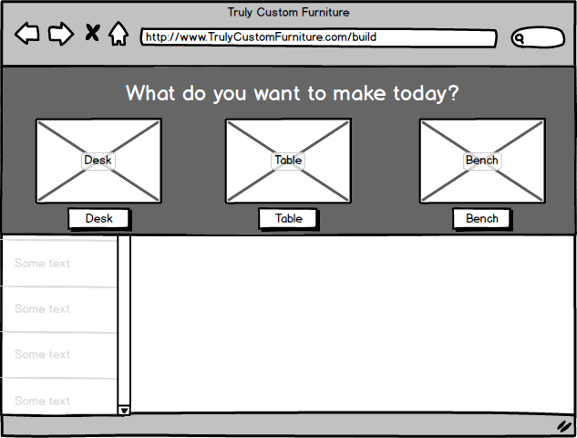
And from there; the mockups:
These mockups were made in Balsamiq, and used to test the interactions of the site with potential users (i.e. random students we bothered in the library)
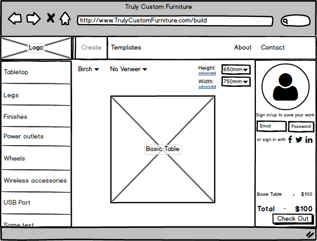
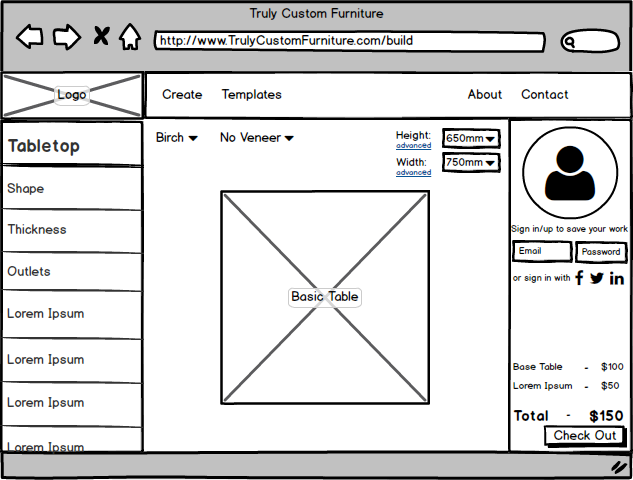
We were surprised to find that our information architecture was sound with only a bit of tweaking after doing some user testing, so we got on with the high fidelity mockups for the demo. I used proto.io for the first time while making the high fidelity mockups, it came out to work pretty well, despite the high demand of my computers RAM.
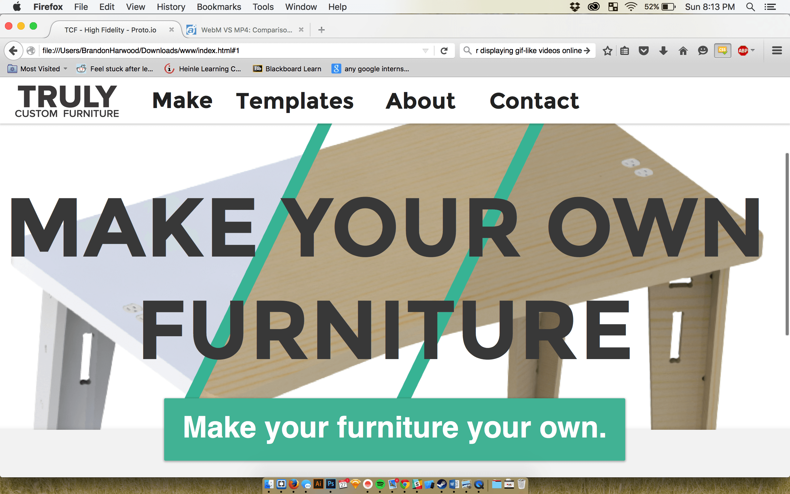
And from there, we were ready to show off the demo:
Conclusion:
This was one of my first Hackathons, and it was one of the best learning experiences I've ever had. The lack of sleep, with the team comradery, mixed in with new technologies, and not to mention the connections! I had a great, great time with my team, and despite the fact we didn't place, I wouldn't have had a better time with anyone else. I learned a few things in particular over the weekend, like sleep is pretty great. But besides that, UX isn't just about the design at all, it's about working with a team, using science to make decisions, and you really need to understand the business in order to make something worth using.